
Style Guides
What Dopamine Decor Actually Means for Your Home
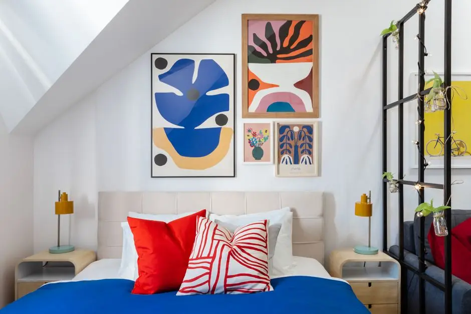
Photo by TurnKey Apartments on Pexels
Dopamine decor means decorating with color, pattern, and objects you actually love instead of a “safe” neutral palette — the theory being that a room that makes you smile does more for your mood than one that just photographs well. None of the ten ideas below need a full remodel, a contractor, or your landlord’s permission; most are paint, textiles, and things you can hang without drilling a single hole in your space.
What Dopamine Decor Actually Means
The dopamine decor trend is really just a name for decorating on purpose instead of decorating safe. Dopamine itself is a neurotransmitter tied to motivation, mood regulation, and pleasure — part of the brain’s reward center — and the decor world borrowed the word as shorthand for “this room makes me happy,” not as a literal clinical claim. Psychologists haven’t isolated a single “dopamine color,” but the general link between color and mental health is real: warm, saturated colors are consistently tied to higher energy and better mood than muted neutrals, according to Psychology Today’s coverage of how color affects brain functioning. Cool colors read as calming instead of stimulating, which is the whole reason a beige apartment feels neutral rather than joyful — it’s not doing anything, on purpose. We’re not going to tell you a coral throw pillow releases a measurable hormone; we will tell you that a room full of colors and art you picked on purpose reads happier, and does more for day-to-day well-being, than one you picked to avoid offending a future buyer. This isn’t a new branch of interior design so much as an old idea with new home decor branding — happiness was always the point.

Photo by Steph Wilson on Unsplash
Build a Color Palette That’s Actually Yours
Pick two or three colors you’d wear before you pick colors that “go together” on a paint chip. A vibrant palette built around what you already reach for in your closet holds up longer than one copied from a mood board, because you already know you like it. Warm, high-saturation colors — a true red, a hot pink, a genuine yellow — read as more energizing than their pastel or muted cousins; if a color scares you a little on the swatch, that’s usually the one doing the most work. You don’t need a full rainbow in one space — a curated aesthetic of two or three colors, repeated across a few objects, reads more intentional than one of everything. Start with one wall or one textile category, not the whole room at once: a $45 gallon of exterior-grade interior paint on one accent wall gets you most of the transformation for a tenth of the commitment of repainting four walls and a ceiling.
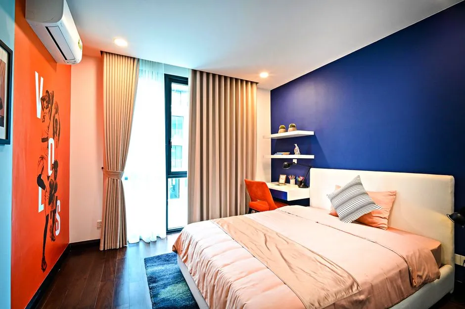
Photo by Huy Quang Nguyễn on Pexels
Layer Print and Pattern Instead of Playing It Safe
A plain white apartment reads like a hotel room nobody checked into — pattern is what tells a visitor a person actually lives there. Floral, geometric, and gingham can all live in the same room if they share a color family; the eclectic mix is the point, not a mistake to correct. Peel-and-stick wallpaper is the fastest, most renter-friendly way to try a bold print on one wall without committing to paint or a lease violation — a single accent-wall panel runs $25–45 and comes down clean at move-out, though it’s worth testing a small piece in a low-visibility spot first since adhesion varies by wall texture. If a full wall feels like too much commitment, start smaller: a patterned rug, a patterned lampshade, or one patterned throw does the same visual work in miniature.
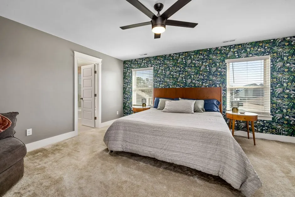
Photo by Curtis Adams on Pexels
Turn a Blank Wall Into a Poster Gallery, No Nails Required
A gallery wall of mismatched posters and prints is real wall decor, not a single lonely print, and it’s the single highest-impact, lowest-cost decorative idea on this list. A blank wall is the most common reason a colorful room still feels unfinished. A picture-hanging hook or a Command strip does the actual work here: they’re rated by size, not by vibe, and 3M’s own weight limit guide puts small picture-hanging strips at around a pound per pair and mediums at a few pounds more, nowhere close to a framed print with glass — check the rating before you commit a wall’s worth of art to strips rated for a postcard. Mix frame sizes and leave uneven gaps on purpose; a perfectly gridded gallery wall reads like a hotel lobby, not a collection. A cheap flea-market find can outperform an expensive one here the same way it did on a patio makeover we once built around a $30 galvanized washtub turned water feature — that thrifted piece got more comments than the $220 lounge chair sitting right next to it, which is really the whole argument for this section in one sentence.
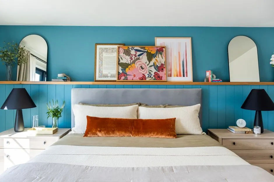
Photo by ASR Design Studio on Pexels
Add Texture With Pillows, a Vase, and Something That Doesn’t Match
Texture is what keeps a colorful room from reading flat in photos and in person — a smooth cotton pillow, a nubby knit throw, and a glossy ceramic vase in the same color family do more than three cushions in the same fabric ever will. Two or three pillow covers in patterns that don’t match each other, layered on a plain couch or sofa, cost $8–15 each and swap out seasonally without touching the furniture underneath. A single statement vase — thrifted or new, $12–25 — earns its spot on a shelf or coffee table even with nothing in it; add one stem when you remember to, and don’t stress about it when you don’t. (We own throw pillows that have genuinely never been sat near, only styled. No regrets.)
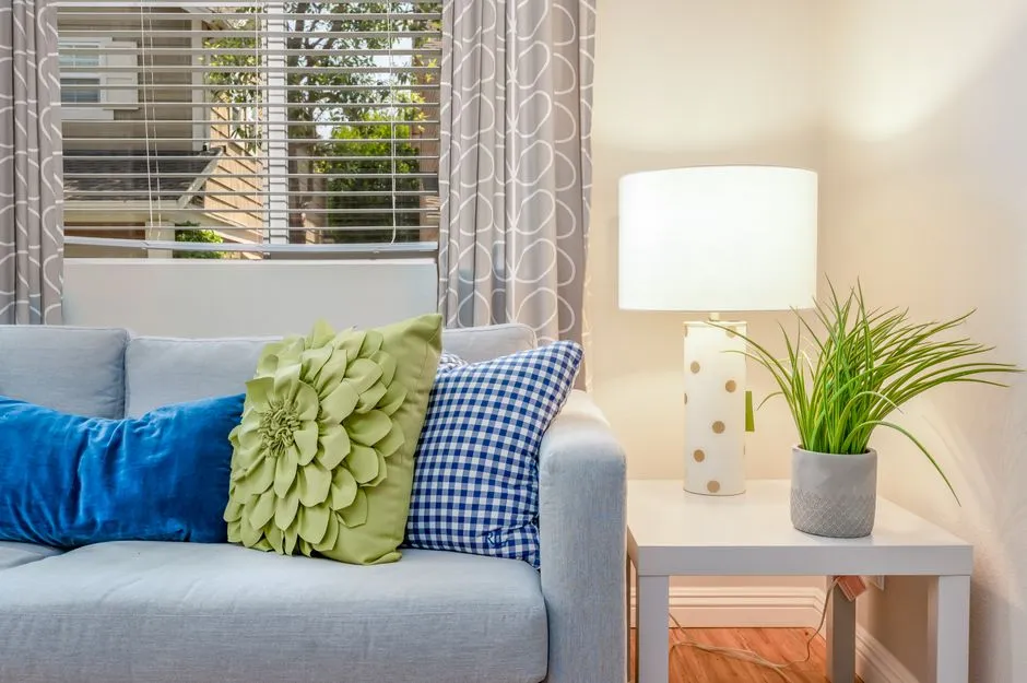
Photo by Terry Magallanes on Pexels
Bring In Plants for the Playful, Kawaii Layer
Green is doing double duty here — it’s a genuine color in the palette and it’s alive, which reads differently than a poster no matter how good the poster is. A cactus or succulent in a $6–10 quirky novelty pot with a face on it is the cheapest, hardest-to-kill way into this look; kawaii planters are a real category now, not a joke, and their cute aesthetic photographs better than a plain terracotta pot for the same three dollars more. Real plants don’t belong in every corner — a dim, north-facing room with one small window is real-plant murder, not a failure of your care routine, and a good faux fiddle-leaf fig gets you 90% of the visual payoff with zero guilt about the light situation. Group two or three plants at different heights instead of one lonely pot on the floor; a cluster reads intentional, a single plant reads forgotten. A single fresh-cut flower in a small vase does the same trick on a smaller budget.
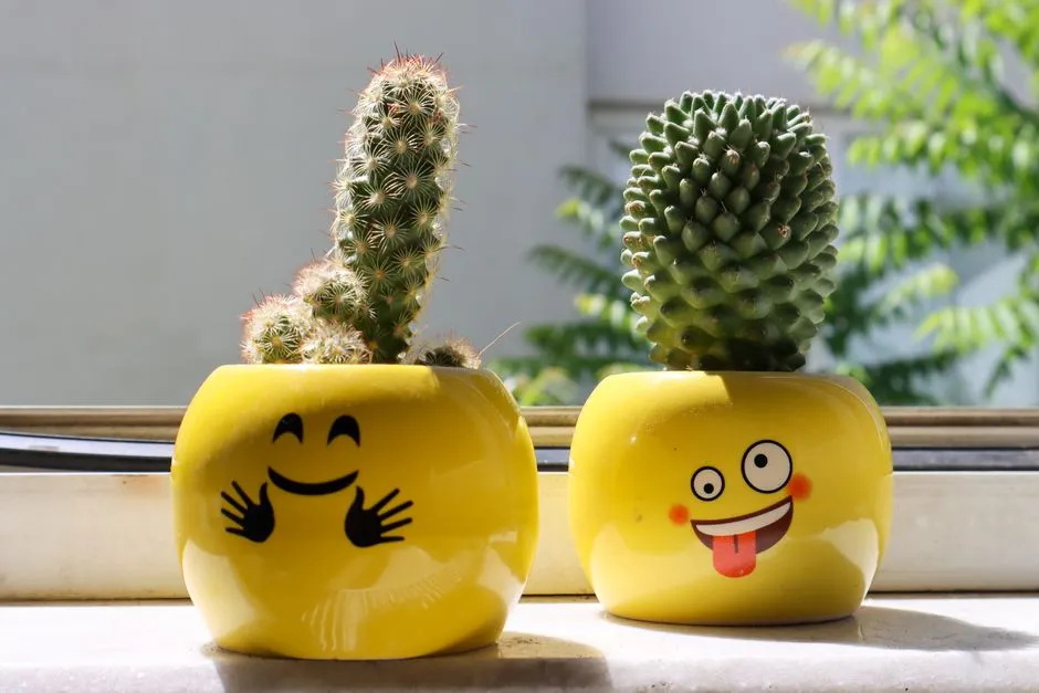
Photo by Samer Daboul on Pexels
Layer Lighting — a Colorful Lamp, a Night Light, a Little Neon
Paint and lighting solve more of a room’s problems than new furniture does, and lighting is the cheaper half of that equation — nothing changes a room’s atmosphere faster than swapping what’s glowing in it after dark. Swap a plain white lamp for one with a colored glass or ceramic base — $20–40 gets you a real focal point on a nightstand or side table instead of a fixture nobody notices. A small LED neon-flex sign or a warm night light adds a colorful glow after dark for $25–40 and runs on low-voltage power, which makes it one of the few “statement lighting” upgrades that’s genuinely renter-safe with zero wiring involved. Keep it to one glowing object per room; two neon signs in the same nook stops reading as personality and starts reading as a themed bar.

Photo by Jakub Palovič on Unsplash
Apply Dopamine Decor Room by Room
Good room decor changes shape depending on which room it’s in — a bedroom can go bolder than a room guests actually sit in, and a desk needs to stay functional under the fun.
In the Bedroom
The bedroom is the lowest-stakes room to go bold in, since you’re the only regular visitor to the bed itself. A colorful accent wall behind the headboard, two mismatched pillows in front of the standard shams, and a warm-toned lamp on each nightstand cover most of the transformation without touching the mattress or the layout.
In the Living Room and Dining Room
Living rooms and dining rooms benefit from restraint since more people see them at once: pick one anchor — the gallery wall or the pillows, not both maxed out — and let the rest of the space stay simpler so the anchor actually reads as one. A single bold runner or a set of colorful mismatched chairs does the same job at a dining table that a gallery wall does on a living room wall.
In the Kitchen
A kitchen is the easiest room to underdecorate, since most of the surfaces are already busy with appliances — a set of colorful dish towels, a patterned rug in front of the sink, and a shelf of mismatched ceramic mugs add the look without touching a cabinet.
At a Desk or Reading Nook
A small nook is the easiest place to go all-in, since a desk’s worth of colorful stationery, a smiley planter pot, and a patterned mousepad cost less than any single idea above and don’t require touching a wall at all. It’s also the fastest way to make a cozy corner feel like yours instead of leftover apartment space.
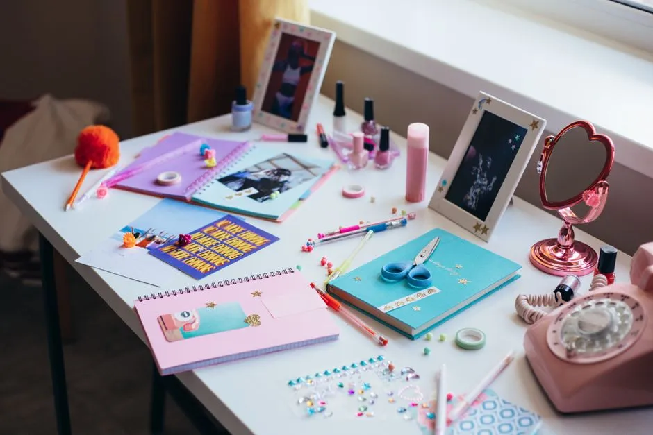
Photo by cottonbro studio on Pexels
The Honest Math: What a Dopamine Decor Refresh Actually Costs
Here’s the honest math, added up instead of estimated: two posters and frames ($40), three pillow covers ($36), a smiley planter pot with a plant ($20), one colorful lamp ($30), and one peel-and-stick wallpaper panel ($40) comes to $166 — comfortably under a $200 total for a room that touches nearly every idea on this list. A cheap version and a splurge version both exist here: the same list done entirely in thrifted and clearance finds can land closer to $80, while swapping the lamp and one poster for higher-end pieces pushes it toward $300. Neither is wrong — the honest number depends on what you already own and what you’re starting from zero on.

Photo by Karola G (kaboompics.com) on Pexels
Rule of Thumb: Curated Maximalism, Not Clutter
The line between “dopamine decor” and “cluttered” is intention, not item count — a room with forty objects you chose on purpose reads curated, and a room with four objects that landed there by accident reads unfinished either way. If a piece doesn’t make you smile or serve a function, it’s not adding to the look, it’s just in the way; that’s the one rule worth applying before every new purchase. Minimalism and a true maximalist room are aiming at the same feeling from opposite directions — a calm, intentional room, with real aesthetics behind the choices instead of accidents — so borrow the minimalist habit of editing even while you’re piling on color. Start with the wall. Everything else on this list looks more finished once there’s something worth looking at while you build out the rest.

Frequently asked questions
Is dopamine decor a thing, or just a trend name?
It's a real, documented shift in how people decorate — search interest and major retailers (IKEA, Wayfair) both track it as a category — but it's also genuinely just a name for something people have always done: surrounding themselves with colors and objects that make them happy instead of ones that photograph well. The label is new; the instinct isn't.
What is dopamine decor?
Dopamine decor is decorating with bold color, pattern, and personal, joyful objects instead of a safe neutral palette — the opposite of a beige rental or an all-white minimalist room. It prioritizes how a space makes you feel over how it matches a single cohesive design scheme.
What colors stimulate dopamine?
No single color is scientifically proven to trigger dopamine on its own, but psychologists consistently link warm, saturated colors — red, orange, yellow, hot pink — to higher energy and better mood than muted neutrals like gray or beige. Cool colors like blue and green tend to read as calming rather than stimulating, which is why most dopamine decor rooms lean warm.
What are some examples of dopamine decor?
A gallery wall of mismatched posters, a bright accent wall or peel-and-stick wallpaper panel, patterned throw pillows in colors that don't match the sofa on purpose, a collection of colorful ceramic pots, and a warm-toned lamp instead of a stark white one are all classic examples. The common thread is personal joy over showroom coordination.
Where can I buy dopamine decor online?
Etsy and small print shops are the best source for affordable art and posters in this style; thrift stores and Facebook Marketplace are the best source for the colorful ceramics and vintage lamps that make a room feel collected instead of shopped-in-one-trip. Big-box retailers carry a version of the look too, just at a higher markup for the same color story.