
Bedroom
The Best Color for Bedroom Walls, Room by Room
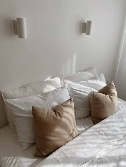
Photo by Aljona Ovtšinnikova on Pexels
The best color for bedroom walls depends on two things you can check before you buy a single sample pot: how much daylight the room gets, and how big it actually is with a tape measure, not on the listing photos. A $60 can of paint gets a bedroom most of the way to feeling redone, for a fraction of what a new bed frame costs — the same math that makes a $30 bulb swap worth trying before a big furniture purchase. Below are 12 real bedroom paint color picks, sorted by light and room size, plus the sheen, trim, and swatch-testing details that keep a good paint color from reading like a bad one.
Warm Neutrals Fix a Bedroom With Little Natural Light
A north-facing bedroom, or one with a single small window, needs a warm neutral, not a true white — plain white goes flat and slightly gray without direct sun hitting it during the day. Look for a warm greige, ivory, or taupe with warm undertones — yellow or red, listed on the paint chip’s back label — not a “cool” or “blue-base” white. A cool-toned white in a dim room reads like an office waiting area, not a bedroom. Test the swatch in the room’s darkest corner at 4 p.m., not next to the window where every color looks better than it will at night.
Sage Green and Soft Blue Calm a Bedroom That Gets Real Daylight
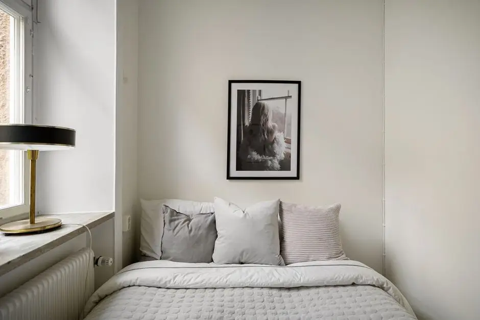
A bedroom with a real afternoon sun patch can handle a cooler hue without going cave-like, and sage green or a soft dusty blue are the two that read as calm instead of cold. Keep the sage on the gray-green side, not yellow-green — a sage with too much yellow in it drifts into what we’d call hospital-hallway territory. Pair either with warm wood tones (a wood nightstand, a rattan lamp) so the room stays airy, with a grounding warmth, instead of sterile. These colors are also the two calming bedroom colors that show up most often in actual sleep and color-psychology research, not just paint-brand marketing copy.
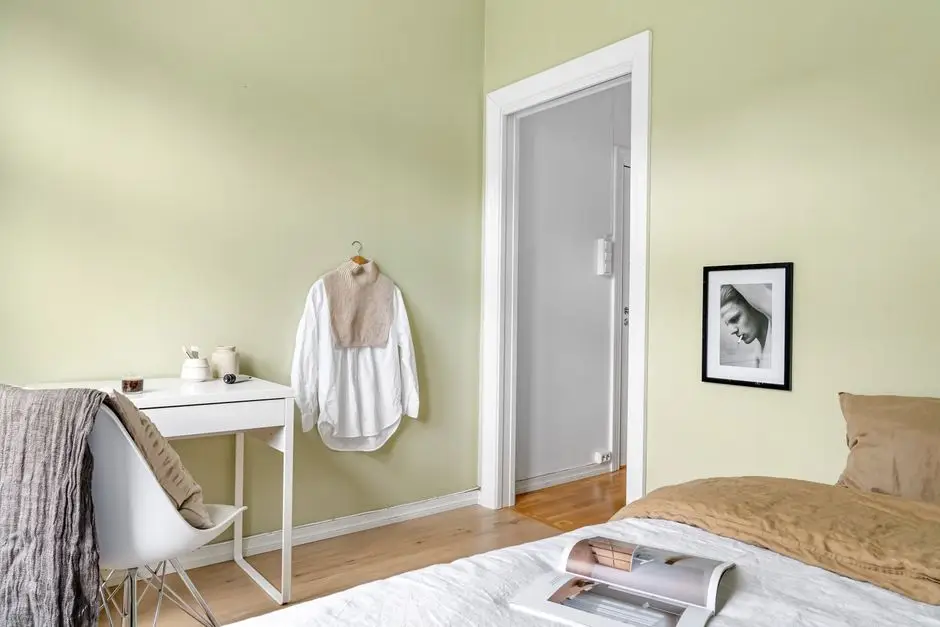
Photo by Alex Tyson on Pexels
Test the Swatch on the Actual Wall Before You Commit to a Gallon
Paint a 2×2-foot swatch directly on the wall in at least two spots — one near the window, one in the room’s darkest corner — and look at it morning, midday, and at night under the lamp you’ll actually use. A rental bedroom of ours once came in a color technically named “Contented Almond.” Three coats of a warm off-white later, the almond was still bleeding through by late afternoon; it turned out the original coat was a stain-blocking eggshell nobody had disclosed, and a $12 tester pot would have caught that in twenty minutes instead of three gallons and a weekend. The swatch card under hardware-store fluorescent light is not the same color it’ll be on your actual wall.

Photo by RDNE Stock project on Pexels
Matte Hides Wall Flaws Best; Eggshell Wins With Kids or Pets
Bedrooms are low-traffic by nature, which is exactly what makes matte paint work well there — it hides drywall seams and old nail holes better than any other sheen, and gives darker, saturated colors a soft, non-reflective look. Sherwin-Williams’ own sheen guide backs this up: eggshell has a touch more shine and is meaningfully more washable than matte, which matters in a kid’s room or a bedroom with a dog that jumps on the bed. If nobody’s touching these walls but you, once a year, go matte. If little hands or paws are involved, pay the small premium for eggshell — the sheen is a small design decision, but it’s the one that decides whether your color palette still looks good after a year of actual living in the room.
Match Trim and Ceiling to the Wall Color, Not to Each Other
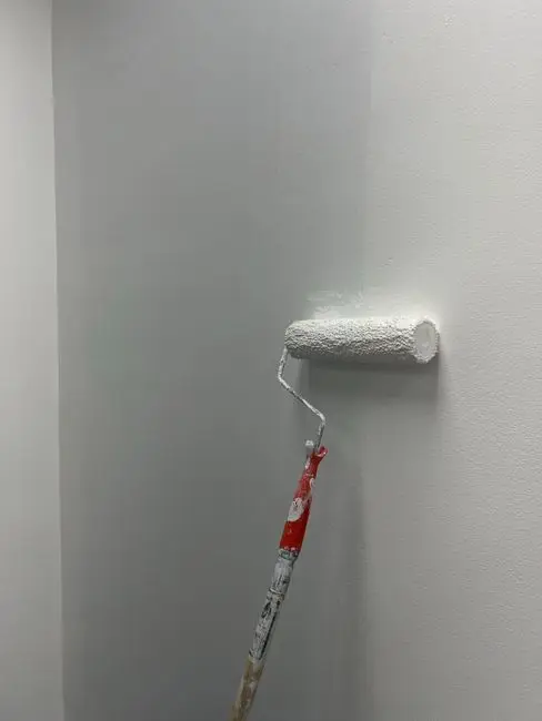
The ceiling doesn’t need to match the trim — it needs to be a shade or two lighter than the wall color so the room still has a visible edge where the wall stops and the ceiling starts. A flat white ceiling over a warm greige wall usually looks better than a ceiling painted the exact same greige, which can make a room feel like it’s shrinking inward. Keep the trim (baseboards, window casings, door frames) in a bright white or off-white regardless of the wall color — it’s the one detail nobody consciously notices when it’s done right, and the first thing that looks unfinished when it’s skipped.
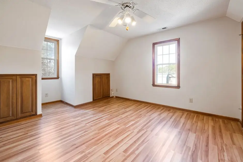
Photo by Curtis Adams on Pexels
Go Moody and Dark if the Room Already Gets Real Daylight
A deep navy, charcoal, or forest green bedroom looks intentional and expensive in a room with at least one large window and a few hours of direct sun. A bold color like this can genuinely envelop and soothe a room instead of overwhelming it, when there’s daylight to soften it. Try the same color in a windowless or north-facing room and it reads like a closet with delusions of ambiance. If you’re set on going dark in a dim room, paint one wall instead of four and lean on layered lamp light rather than the overhead fixture — a dark room lit only from above just looks dim, not moody. This is also where matte earns its keep: a flat, saturated color hides brush marks that a shinier finish would show off.
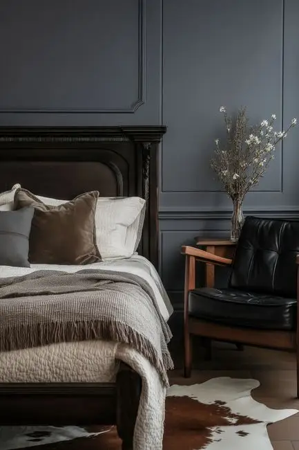
Photo by Adamowicz Adamsky on Pexels
The Best Bedroom Wall Color for a Small Room Is the Lightest One You Can Stand
A small bedroom in a deep color doesn’t automatically feel bigger — light, warm colors bounce more of the available daylight around the space and push the walls back visually, which a small room needs more than a big one does. Ivory, pale gray-blue, and soft warm white are the safest lighter shades under 120 square feet. If you want color, keep it to the ceiling or one accent wall instead of all four; a small room can usually handle one bold surface, not a full wraparound. Our cozy bedroom makeover ideas on a budget has the rest of the low-cost playbook once the walls are sorted — bedding, lighting, and the layer of texture that makes a light-colored room feel warm instead of blank.
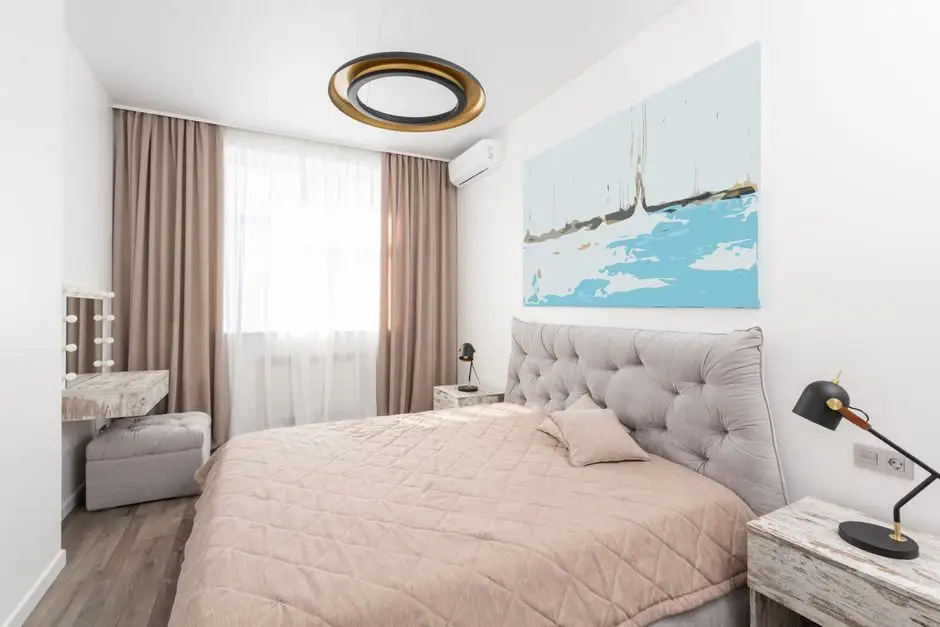
Photo by Max Vakhtbovych on Pexels
Calming Bedroom Colors for Better Sleep Lean Blue, Not Beige
Blue is the color that shows up most consistently across sleep and color-psychology research as genuinely calming, ahead of green and well ahead of neutral tones — beige doesn’t calm anyone, it just fails to annoy them. A muted, slightly gray-toned blue creates a tranquil, calming atmosphere built for relaxation and lower stress, not for energizing you awake; a bright or saturated blue reads as energizing, not restful — the opposite of what you want in the last room of the day. If a full blue room feels like too much commitment, start with bedding and one accent wall before you paint all four — you’ll know within a week whether the color is actually helping you relax or just looking good in photos.
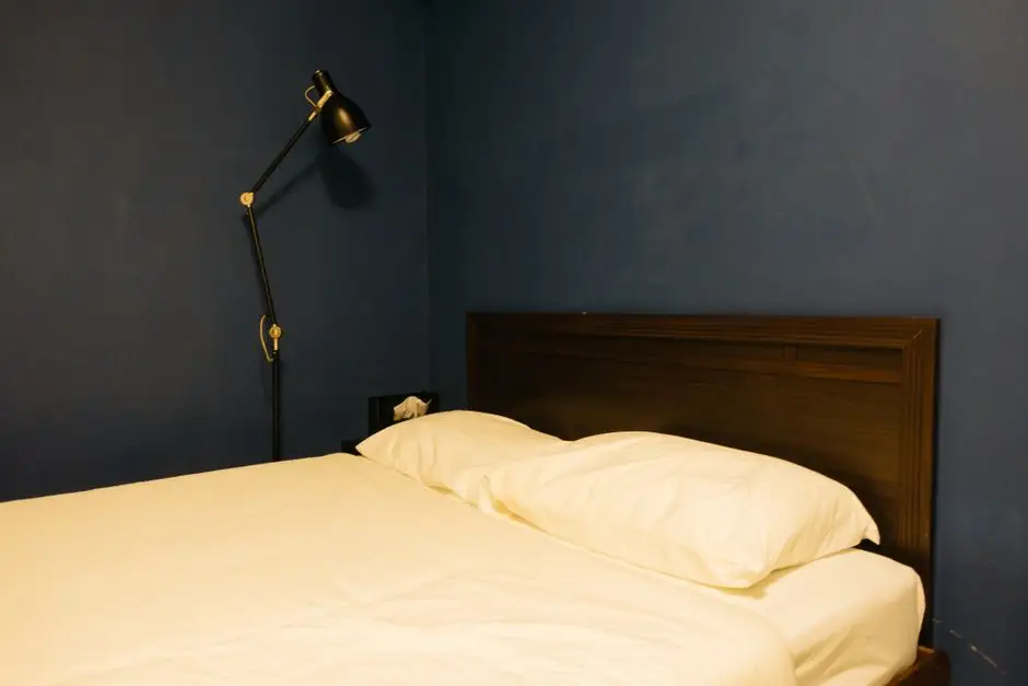
Photo by Markus Winkler on Pexels
The Best Bedroom Colors for Couples Split the Difference
One person’s calming sage is the other’s guacamole, and one person’s moody navy is the other’s cave — the color scheme that actually works for two people is usually a warm greige or a muted blue-gray with enough warmth in it that neither extreme wins outright. Bring both people to the hardware store, or at least both opinions to the same wall swatch, before buying a full gallon. For a shared primary bedroom, our master bedroom ideas guide covers the layout side of this same compromise — where the bed goes matters almost as much as what color is behind it.
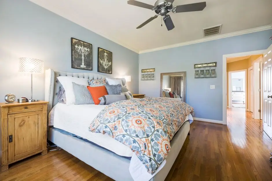
Photo by Curtis Adams on Pexels
Peel-and-Stick Wallpaper Is the Renter-Friendly Stand-In for Paint
Removable wallpaper is genuinely good now, and it’s the one wall change most landlords can’t hold your deposit over — try making that argument with three coats of navy eggshell. It works best on a smooth, flat, low-moisture wall (exactly what most bedrooms are), and it’s honestly the easier renter option for a bedroom compared to the kitchen or bathroom, where steam and grease cause it to lift at the edges over time. A patterned peel-and-stick accent wall behind the headboard gets you most of the visual impact of a painted accent wall with zero primer and a full deposit back. Our warm minimalism guide has more on pairing a patterned wall with a calmer palette everywhere else in the room.
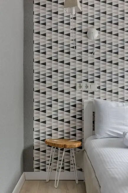
Photo by Max Vakhtbovych on Pexels
An Accent Wall Costs Less Than the Whole Room, and Reads Just as Bold
One accent wall behind the headboard uses roughly a quarter of the paint a full room does, which means you can go bolder — a true navy, a deep terracotta, a saturated green — without the commitment or the cost of covering all four walls in it. Pick the wall behind the bed, not the one you see walking in, so the color reads as a backdrop instead of the first thing that greets you. (One wall is a weekend project. Four walls is a weekend, a Sunday, and a second trip to the hardware store for more tape.) Keep the other three walls in a neutral that shares an undertone with the accent color, or the two will visibly fight.
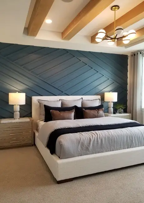
Photo by Christopher Moon on Pexels
For Resale, the Data Says Skip Plain White
Buyers don’t fall in love with your favorite teal — they fall in love with a wall color that’s easy enough to picture their own stuff against, which is a nicer way of saying boring usually sells. But “boring” doesn’t mean stark white: Zillow’s buyer survey data found a pale blue bedroom (“Tradewind”) added about $839 to a home’s sale price over a plain white one, a sage green (“Liveable Green”) added about $1,035, and a navy blue bedroom added about $1,815 — the best-performing bedroom color in the whole study. If you’re painting before a sale, a soft blue or muted sage beats a fresh coat of builder’s white.
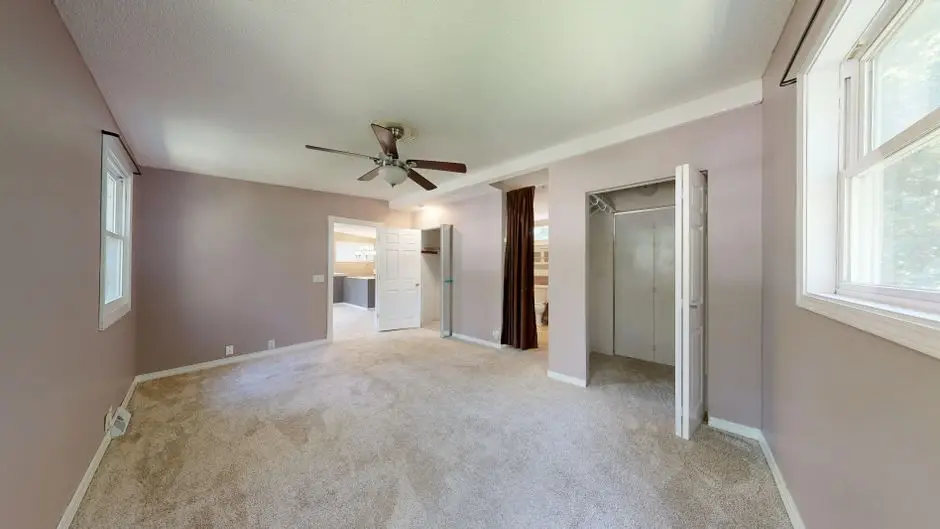
Photo by Peter Vang on Pexels
Start with a tester pot on the darkest wall, not the whole room. The color that looks right at 4 p.m. on a real wall is the one that’s actually right — not the one that looked best on the chip under hardware-store fluorescent light. Once the color’s settled, the rest of the room — bedding, an accent wall, a peel-and-stick backup plan — is just building around it. For the shoppable version of a bedroom color refresh with the actual products, see our bedroom color makeover once it’s live.
Frequently asked questions
What are the top 3 bedroom colors?
Warm neutral (greige or warm white), soft sage green, and a calming blue — usually navy or a pale dusty blue — cover most bedrooms. Which one wins depends on the room's light: warm neutrals fix a dim room, blue and green need real daylight to avoid feeling flat or cave-like.
What colors make a room look expensive?
Deep, saturated colors read as expensive faster than pale ones — a rich navy, forest green, or charcoal in a matte or eggshell finish looks intentional in a way a middle-of-the-road beige rarely does. The trade-off is light: these colors need a room that already gets real daylight, or they read dark instead of rich.
What color should you not paint your bedroom?
Avoid a cool-toned white or gray in a room with little natural light — it goes flat and slightly clinical without sun to warm it up. Also skip a true black or a deeply saturated color in a small, dark room; it swallows what little light exists instead of adding depth.
What are the best calming colors for better sleep?
Blue is the most consistently calming bedroom color across sleep research and color psychology alike, followed by soft green and muted lavender. Bright, high-contrast colors like red or orange are the ones to avoid in a room meant for winding down, no matter how good they look on a mood board.